Website layout
Though the log and color scheme aren’t what I was thinking the basic layout is how I think it should look. A place for pictures and other media as well as a link for new students along with many different tabs that show everything that is needed for the website. Any other information can be put at the bottom of the page.
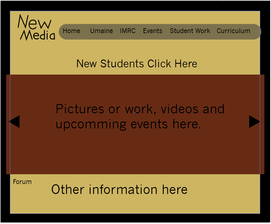

A layout of how I think it should look
This design organizes the site and so anyone who looks at it will know exactly what we are about with the pictures or videos. It’s not hard to find things in the site so people will want to continue looking and learning more about New Media. New students will also be able to easily be directed to a place on the site where they can learn whatever they need to know so they will be more inclined to join the program. Students who are in the program can use the site to learn stuff about the program and events at the collage will be posted so more people will be able to see them.
Workflow
Information will be updated by students as part of assignments and news will be posted on the forum by the people who want someone to show up or the one person who gets the event list.