-
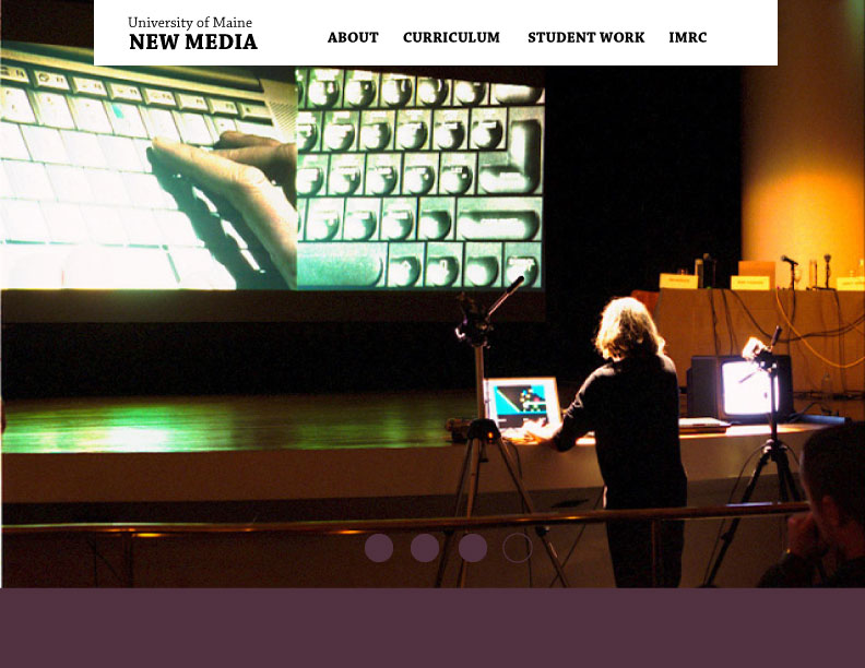
- Sleek homepage with full-width slider and simple navigation menu. The image the slider selects will be outlined in purple, as shown.
-

- Drop-down menus

-

- Users will be able to scroll down to see more info on the homepage.
-

- As they scroll, they’ll see a sample of student work and recent events and highlights.
A big visual on a homepage that attracts people to a college program is important. I think that the circles changing to the picture is a more appealing way to switch to each image instead of arrows. They don’t take away from the design.
I placed University of Maine above New Media as that just makes more sense. It’s the University of Maine’s New Media Department. There shouldn’t be a lot on the navigation menu so anything more I added to the drop-down menus so the user can choose how much further information they want to know. Student Work would be a gallery of all the work that has been documented and also organized by name of each student to see their individual portfolio.
I chose the purple/gray/white color scheme because it was a good contrast from the UMAINE color scheme and also when I think of colors that fit with New Media, I don’t think of very vibrant colors. I think of darker, classier colors that represent technology and the future. The images on the slider should all compliment the purple.
Featured work on the homepage will give users a taste of what they could be creating and be inspired by others. As New Media is all about being new and current, it’s a good addition to have upcoming events and recent highlights to get people interested.