Site needs to be
easy to navigate and find what is the person wants
Grab peoples attention make then interested
Give direction to people so they can easily start using the website
Audience
Anyone interested in new media to keep them interested
Currently in new media
Current site Weakness
It has hints of direction but lacks an element to keep people interested
More important parts like a link for new students needs to be bigger and more interesting
Difficult to find what you want
Everything is very small and nothing pops out
There is nothing on the site that people are directed to and unless they look really hard they will get lost and leave
Hidden jems lost in a sea of uninteresting small words
Strengths
Has a lot of information intergrated
has everything that the site needs but wasn’t presented in a way that people can easily enjoy it.
New site Strengths
It’s clean and well laid out
Not clustered together
New Site Weaknesses
No information
Not enough Directions
Doesn’t capture people attention
It’s not new media feels more like just a school site.
Other websites
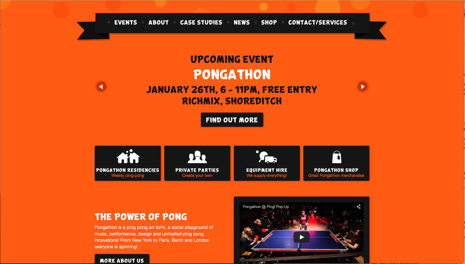
Link:http://www.pongathon.com/
Give direction with events or other front and center
Eye catching and interesting
Makes you want to explore
List of websites — http://tympanus.net/codrops/2011/10/08/25-examples-of-emphasis-applied-in-web-design/
http://www.designer-daily.com/50-great-websites-designs-for-your-inspiration-2372
What we need to do is make navigation for all different people. Parents want to find easy information so they will know exactly what to tell their kids about this program. Students who are in or not yet in the program have different needs. To become interested in the program or to use the features on the site that will help people get involved in the program.
Your comments suggest possible different entry points for different audiences–what do potential students want to explore? current students? parents? employers?
what kind of content & nav scheme would you use to grab and direct the attention of viewers?