Beta Version
Goals:
- To have a visually appealing New Media site
- Make people interested and wanting to learn more
Audience: New Media Students and students applying to college that want to know more about the program
Weaknesses:
- The Navigation Menu has ‘Events’, ‘Groups’ and ‘Calendar’ that have no information on the pages. They should be taken off the menu or updated. The website doesn’t have anything on what’s being taught in New Media.
- I think there should be a curriculum page so others are aware of what they can learn.
- It’s annoying that any title you click opens in a new tab. As long as it’s not taking you to a different website, this isn’t needed.
- Some pictures are repeated on the same page, like Interactive Education.
- Also, on the slider there is a text box and where it says ‘Continue reading’ there should be a different color as you can barely see it, even when the box changes opacity.
- The trip to Europe page doesn’t share anything about why the students went there and what they achieved, it just has tourist pictures.
- There should be a student work page, instead of having to click a link to a portfolio site.
- Info about the faculty should be included
Strengths:
- Nice slider and images on the Home page
- Good color scheme
- Text is easy to read
- Easy to navigate
I think the website could be better if there were more information about the program and if drop-down menus were used, allowing for more options and the pages can be more in-depth.
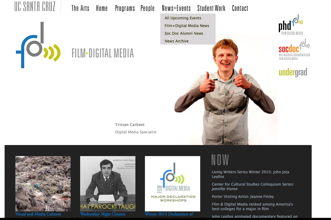
It also would be a good addition to have events and recent activity on the home page so people visiting the page can see what’s currently going on straight away. Featured Work is also a great addition to a home page, to show all the unique student work to keep people interested to learn more and know what’s possible.
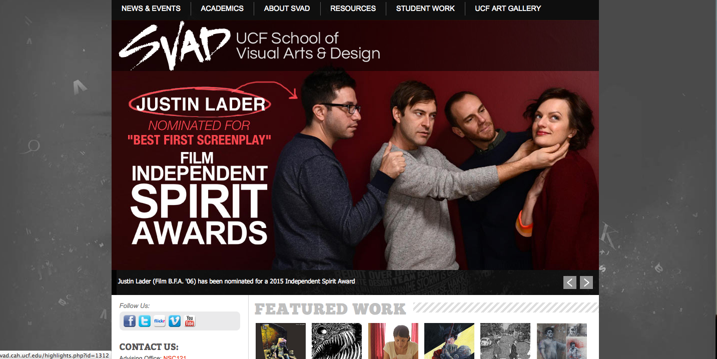
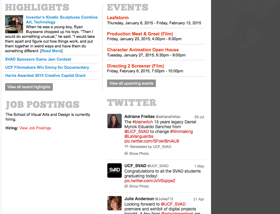
Current NMD Website
Goals: To make an easier to read and simpler design
Weaknesses:
- Looks like everything is jumbled together
- Color scheme
- Such small text
- The Navigation menu is just like regular body text, you can’t really notice it
- It’s never updated
- There needs to be more pictures. On the side bar in Research, instead of just a short description of each field, there should be images to spark someones interest more.
- Text color should not change from black to red, to green, to blue
- Too much text on the Home page
Strengths:
- Functional
- Links like Project yourself at New Media Night 2014 has the content all together so you don’t have to scroll down the whole page. This kind of theme should have been used all throughout the website.
A website just as simple as a huge slider and just the navigation menu to find out more, would be a better design. Then just make sure each page has images and clear text with not too much information pushed onto one page.

Can you use these sample university sites to help design a full navigation menu–with all the necessary content? How would it be organized?
Visual Layout of your choices have clear benefits–what design scheme would you use for UMaine NMD?