
NMD Website Visual_aidanbauer
I feel obliged to note that neither these colors or the background should be considered set in stone; I decided to play it safe and stick with the current color scheme, but, like I said, that can change quickly. I decided to go with sections like About Us, Student Work, and Events in the navbar, […]
Website visual_Meghan
To find what I’d like to see in our NMD site, I didn’t quite have to go far. The UMaine virtual tour page actually looks pretty similar to what I want for the front page of our NMD site. http://go.umaine.edu/visit/virtual-tour/ I like the idea of being able to enter the IMRC virtually and see what […]
NMD Website Visual_DustinMorse
I personally dont think that the new website needs to a whole new theme, but it def needs more added to the maine page to spice it up a bit. Though a drastic change to the layout I would be fine with also. Either way something needs to be added to the cosmetics of the […]


NMD Website Visual_adamlynch
The theme I have chosen gives the site a sleek and more modern look (hence the name of the theme “Twenty Fourteen”). I think this goes well with the idea of “New” Media and helps it stand out when people visit the page. It also has an interesting layout and allows for easier navigation by […]


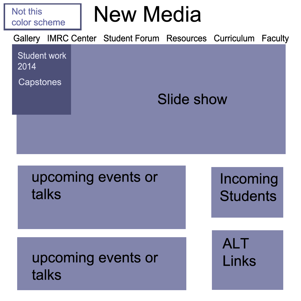
NMD Website Visual_Maria Sutryn
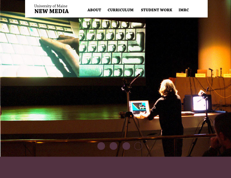
A big visual on a homepage that attracts people to a college program is important. I think that the circles changing to the picture is a more appealing way to switch to each image instead of arrows. They don’t take away from the design. I placed University of Maine above New Media as that […]
NMD Website Visual_Sarah Courtright
I don’t really have an issue with the updated site’s layout; it’s the content that I feel needs improvement and organization. I thought the large slide show on the how page was a nice use of space and the images felt like the most “New Media” part about the site. I felt that the first […]

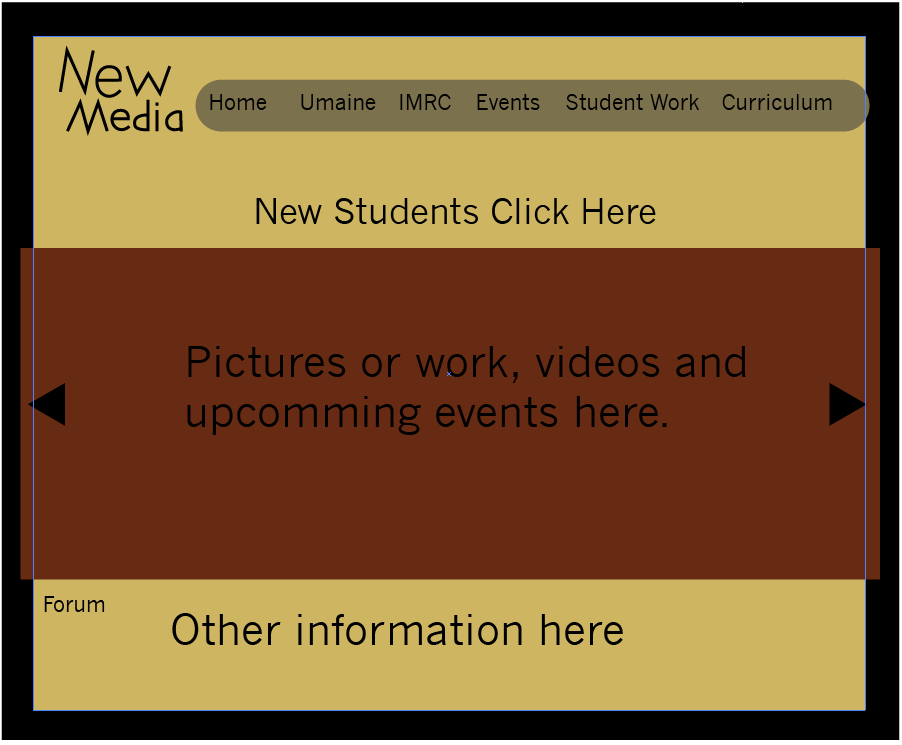
NMD Website Visual_KevinBoucher
Website layout Though the log and color scheme aren’t what I was thinking the basic layout is how I think it should look. A place for pictures and other media as well as a link for new students along with many different tabs that show everything that is needed for the website. Any other information […]
